- 2024 HONOREE
- Long View
YouTube Campus Expansion
EHDD Architecture
Design Team
EHDD Architecture
Brad Jacobson
Principal In Charge
Rebecca Sharkey
Design Principal
Ken Powelson
Senior Project Manager
Mary Lee
Project Manager
Doris Guerrero
Interior Design Lead
Lindsey Quinones
Interior Designer
Heidi Hanzawa
Interior Designer
Kristin Ishii
Project Architect
Monica Lin
Project Architect
Zachary Gong
Architect
About the Project
This project involved adding two new buildings to our Confidential Client’s existing headquarters. Our challenge was to integrate the client’s brand expression into a bold and unique new identity for the campus, while extending a cohesive and seamless experience, amplifying sustainability, wellness, and user experience for all.
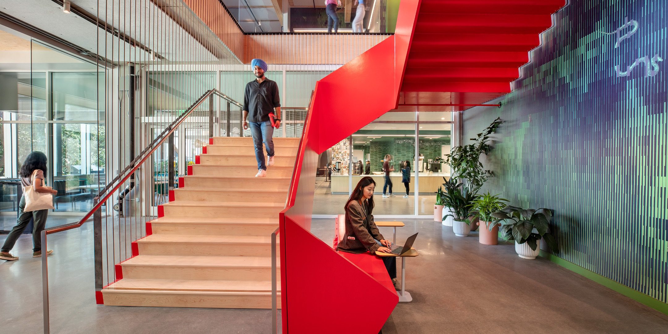
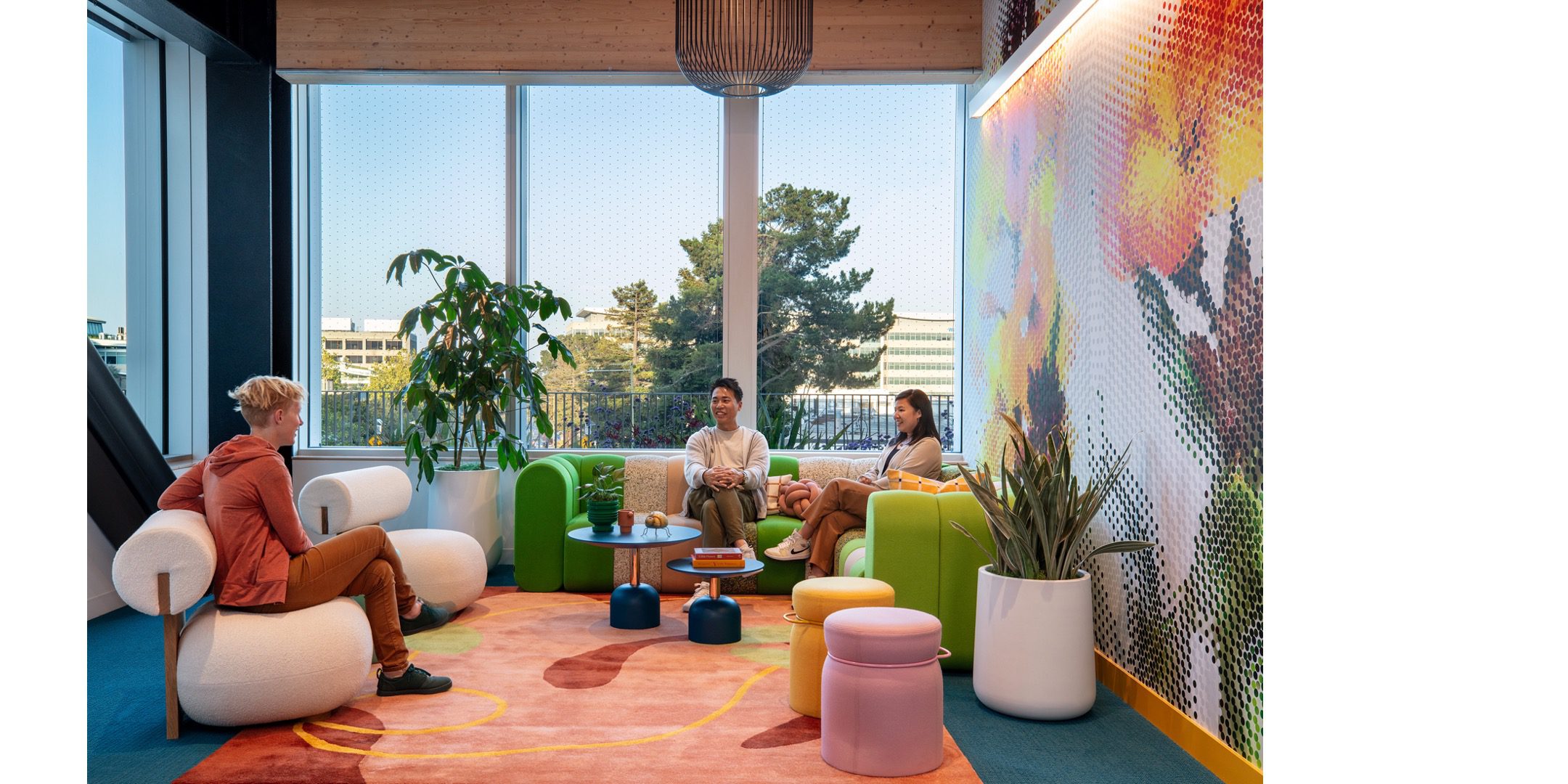
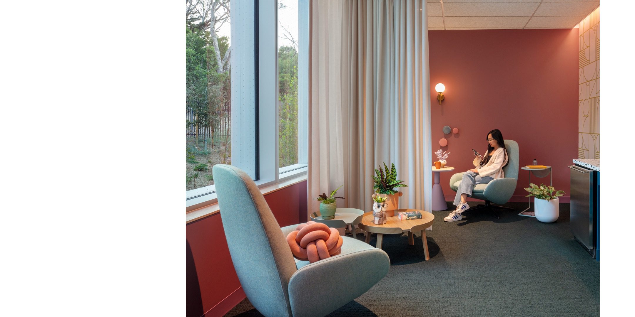
Our team embraced the concept of memes—which are signifiers that spread and evolve over time through commentary, imitation, and reinterpretation—to express features of the local landscape. We translated the natural environment into digitized abstractions to create fun, witty, and colorful palettes that were personalized and non-repetitive. By treating the interior reinterpretation of the landscape as a meme, our design amplified brand expression through all layers of the interior design, including color, pattern, graphics, furniture, and art installations.
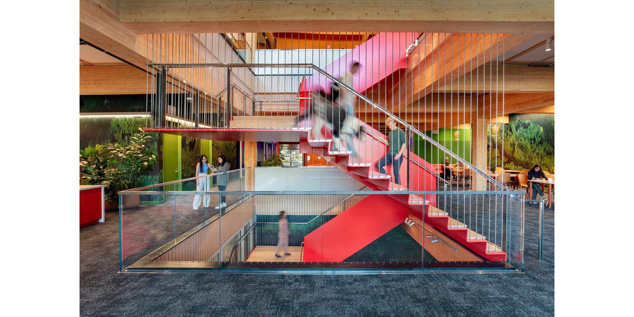
Custom environmental graphic patterns create a heightened experience at the central “stack” of every neighborhood, where shared amenity programs and resources are concentrated. This contributes to user identity and mental mapping, providing a legible spatial hierarchy and moments of punctuation throughout.
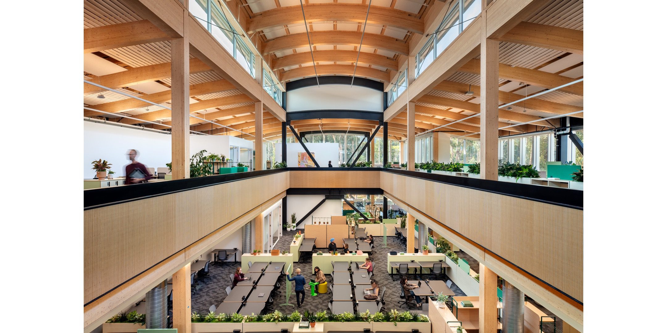
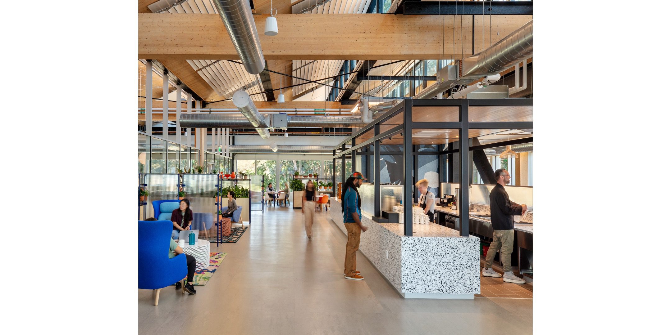
Leading the way to a carbon-free future, the project’s climate positive approach employs mass timber construction; carbon optimized facades and interior systems; onsite rainwater collection; onsite PV array and battery storage; and a state-of-the-art microgrid. Using sustainably sourced mass timber and low-carbon materials reduced embodied carbon emissions by nearly 22,000 metric tons of carbon dioxide equivalent, factoring in sequestration.
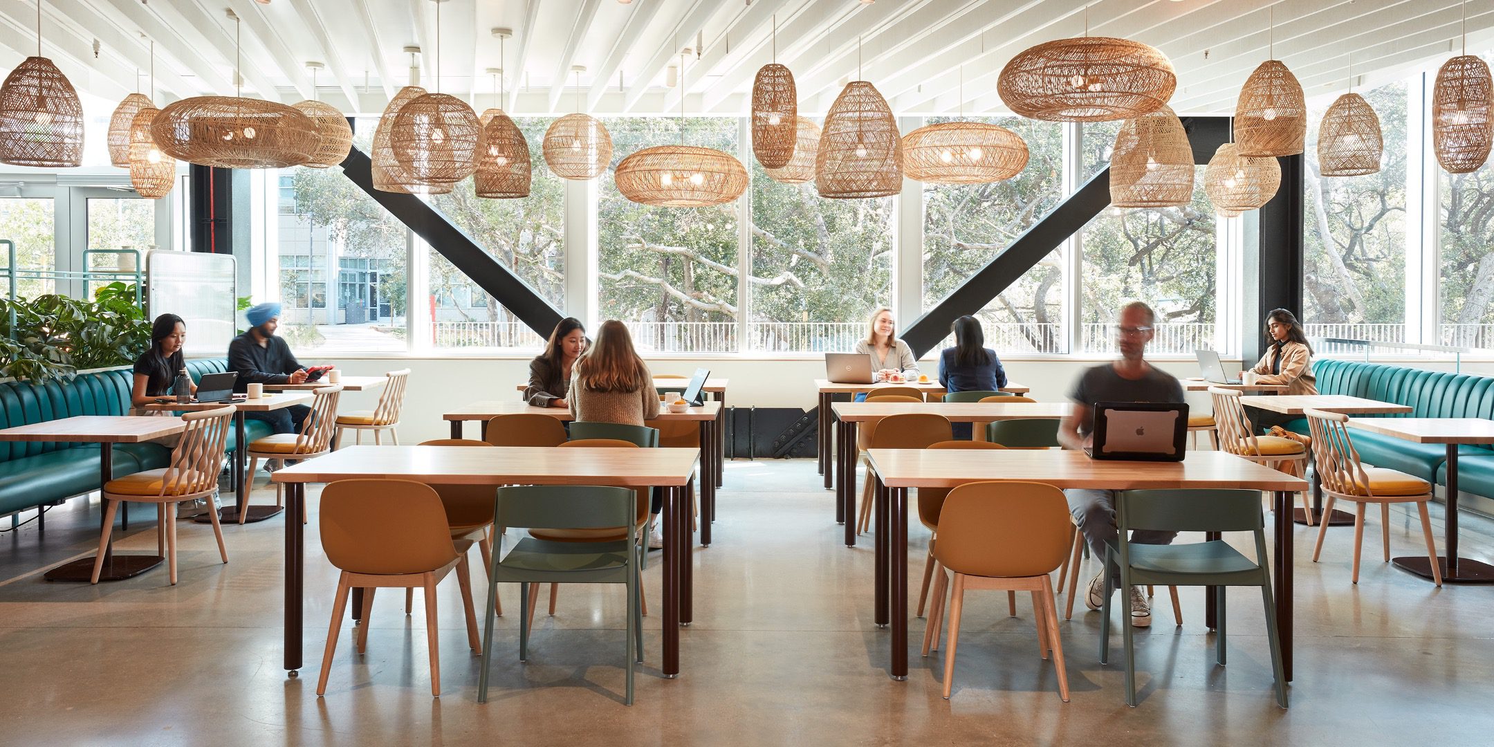
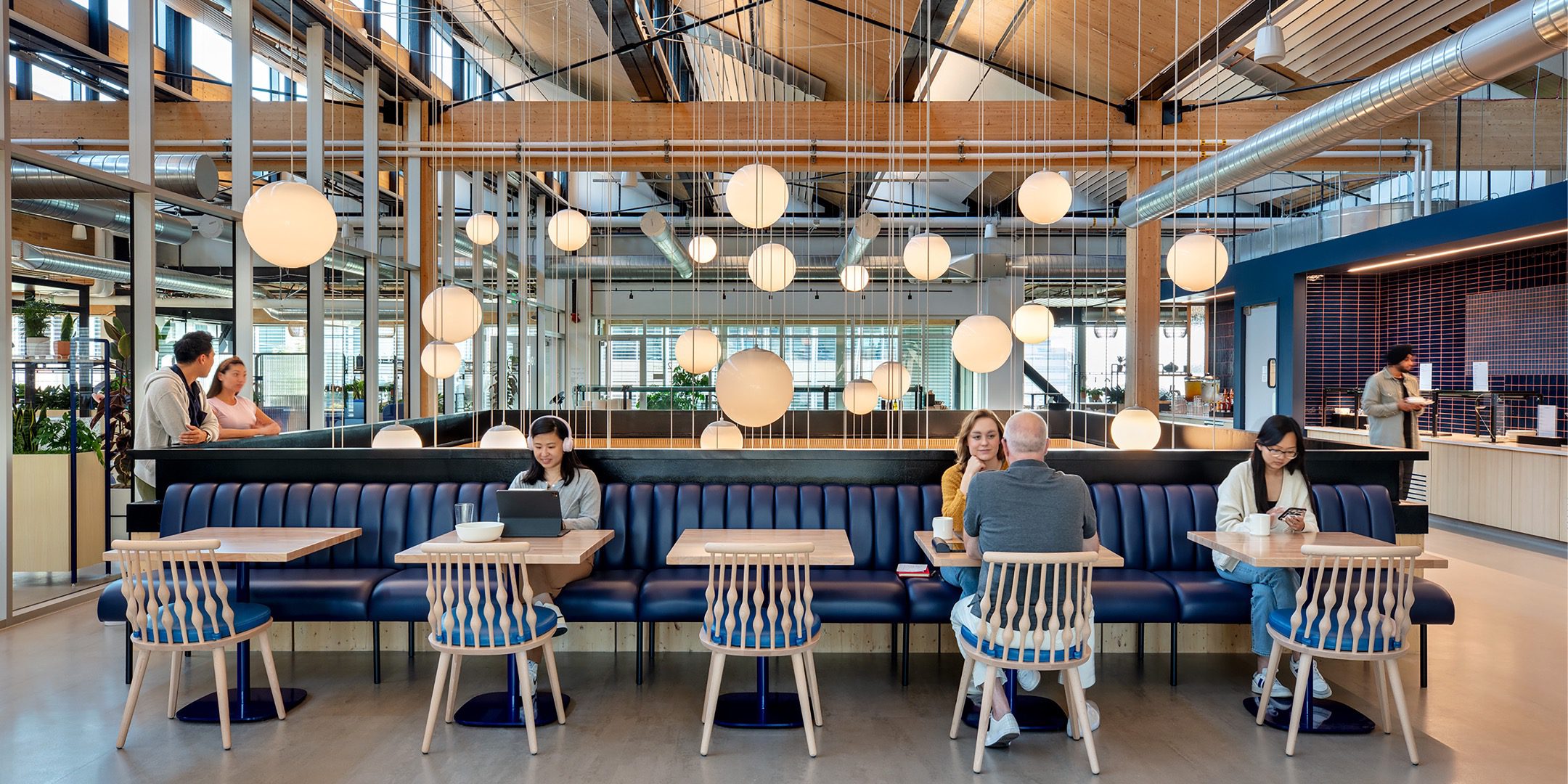
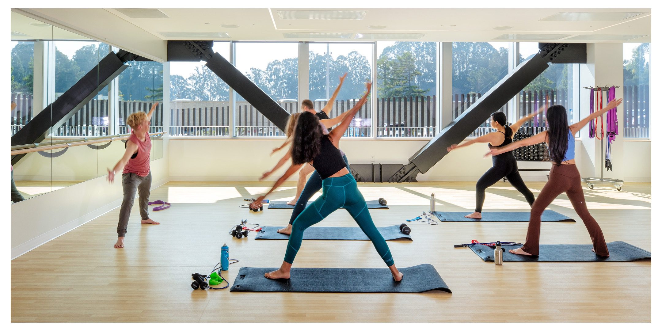
Built with future users in mind, the project integrates biophilic principles into its naturally lit office, “sawtooth” roof windows, and automated window shades that control glare and heat gain. The design offers a variety of spaces for user autonomy, accommodating a diverse spectrum of needs, preferences, and abilities. The team meticulously selected healthy, low-emitting materials, that meet LEED environmental quality standards.
The interior design approach to the two-building Campus Expansion amplifies brand expression with a heightened experience of the surrounding local landscape, creating an iconic new campus identity and a new standard for biophilic, user-centric workplace design.
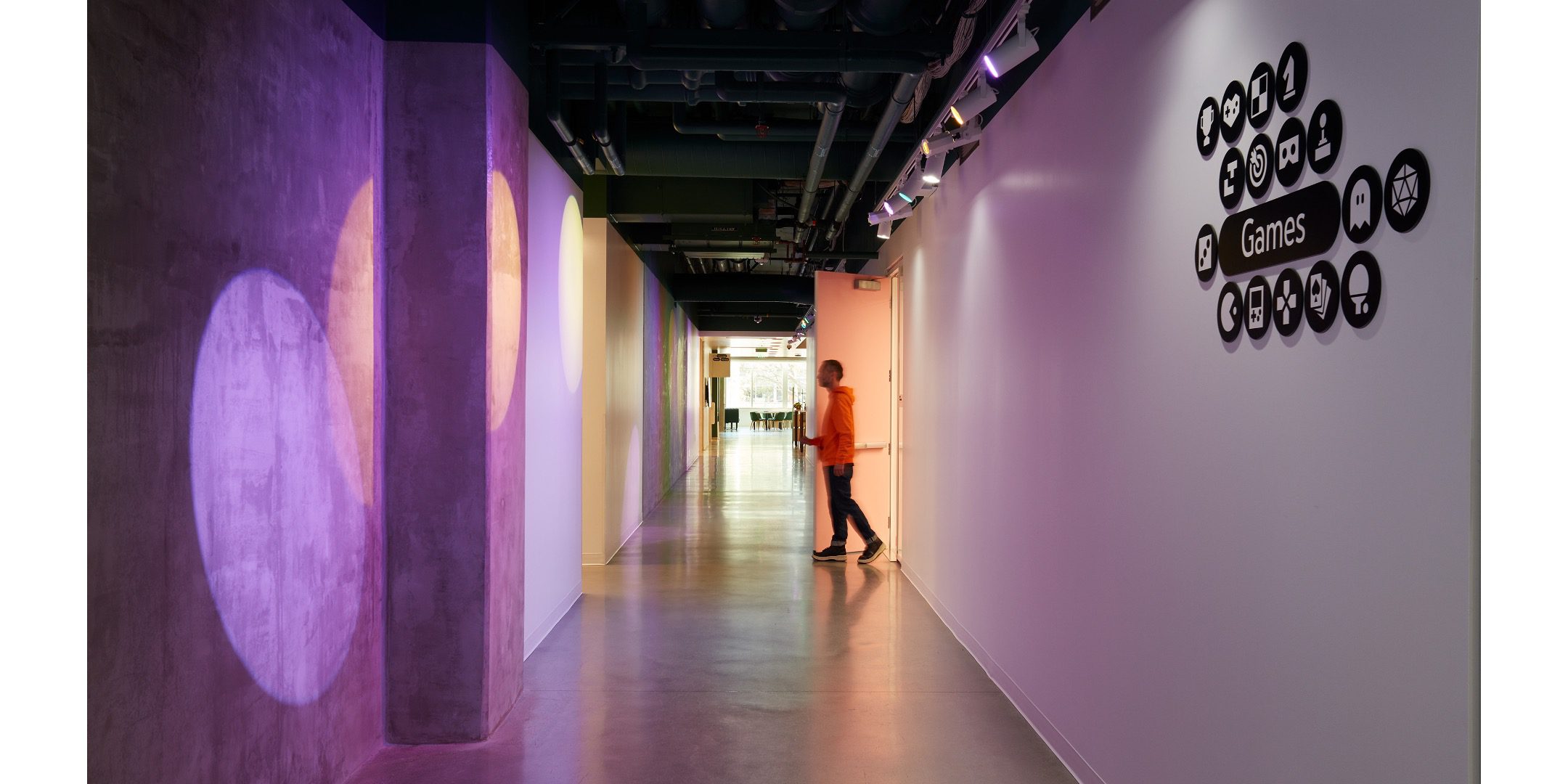
Immersive environments were created through lighting installations that cast RGB shadows along common, central circulation paths, economically creating interactive and playful environments that stimulate engagement and delight.
Shared amenity programs and resources were concentrated in central neighborhood “stacks.” Custom environmental graphic patterns create a heightened experience at each stack. Interior finishes and colors for each of the unique circulation stacks were considered and coordinated, as the colors of the lights reflected and bounced off the painted wall surfaces throughout the environment.
This design went through a rigorous coordination and mockup effort to ensure that base building egress lighting and MEPF infrastructure in the ceilings would not interfere with the display, and that the lights were located to create crisp, dynamic shadows at optimal angles.
Client Statement
Throughout this project, we focused on blending the beauty of nature with functional spaces. Sustainability is our cornerstone—we strive to create environments that not only look stunning but also minimize our impact on the planet.
Natural light within the spaces was important to us. It’s more than just brightness; it’s about creating a connection to the outdoors and boosting well-being. Choosing natural materials isn’t just about aesthetics; it’s a conscious decision. We picked materials that are kind to the environment, and sourced responsibly and locally whenever possible. For example, we used sustainable mass timber materials to support our ambitious carbon reduction goals. We also used smart energy systems to make spaces more efficient and less reliant on artificial energy.
This project wasn’t just about creating great-looking spaces; it was about creating a way of working that’s sustainable and environmentally focused while offering beautiful, functional, and comfortable spaces for everyone.
General Contractor
McCarthy Building Companies
Dan Crosby
Principal-in-Charge